




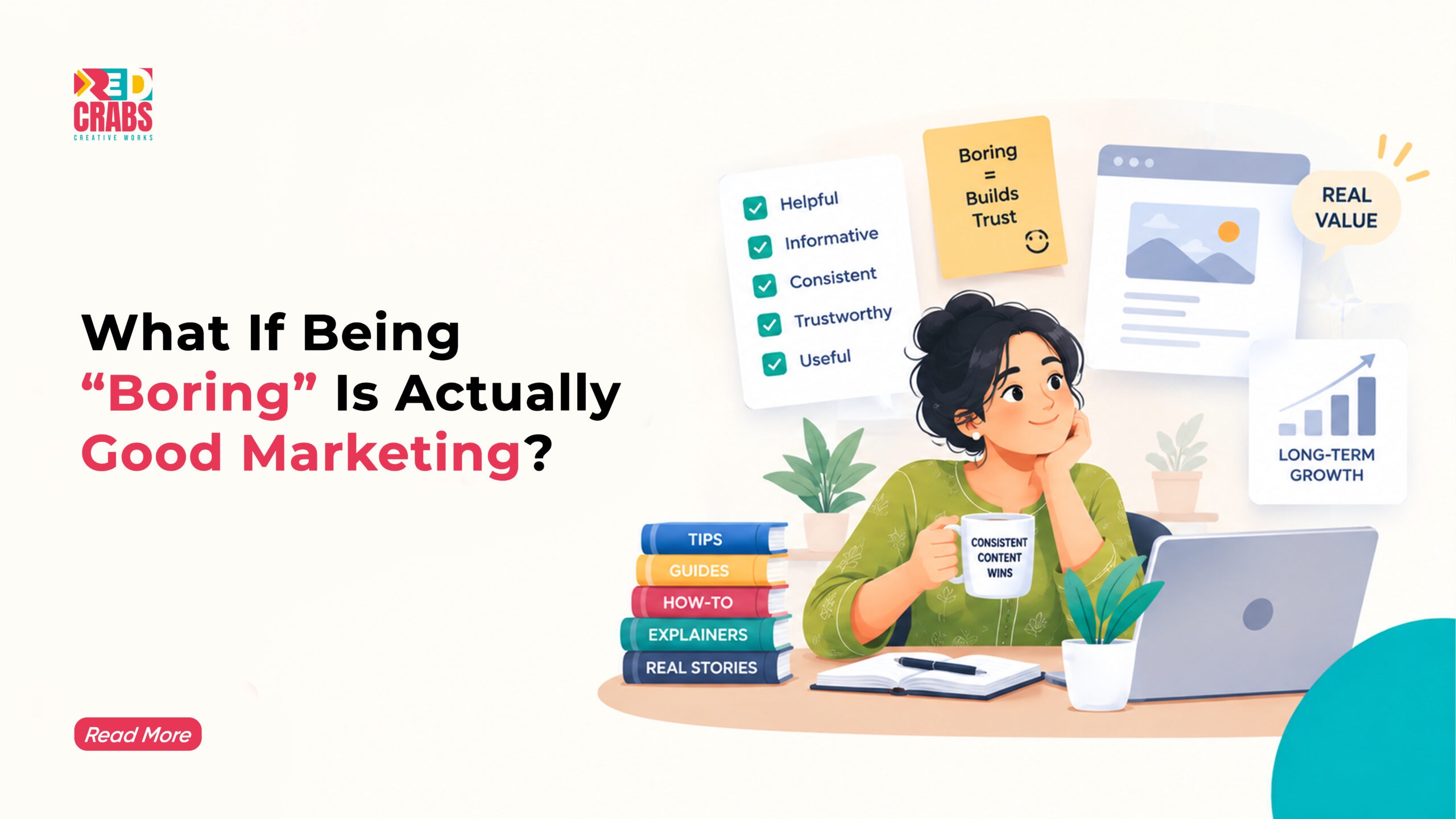




There is a strange pressure on businesses today to constantly become something new. Every few months, there is another trend to follow, another platform to enter, another visual identity to refresh, another campaign format to experiment with, and another competitor announcing that they have “redefined” their brand. Somewhere along the way, reinvention became associated with ambition. If a business is not changing dramatically, it can almost look as though it is standing still.
But some of the strongest businesses in the world do something very different. They keep doing what they are known for, become better at it, and grow without repeatedly changing their identity. Their logos may evolve, their products may expand, and their communication may adapt, but the central idea people associate with them remains remarkably stable. Customers know what to expect, employees understand what the business stands for, and the market can recognise the brand even when the individual campaign changes.
That raises a more interesting question than whether businesses should reinvent themselves: what if growth does not always require reinvention?
In many cases, the businesses that continue growing are not constantly searching for a new identity. They are getting better at expressing the identity they already have. They understand that a brand is not a campaign, a colour palette, or a social media trend. It is a collection of expectations built over time. When those expectations are consistently met, trust becomes easier to build and buying decisions become easier to make.
This is where brand consistency becomes much more than a design principle. It becomes a business advantage.
Reinvention Is Not the Same as Progress
The word “reinvention” sounds exciting because it suggests movement. Businesses understandably want to be seen as innovative, relevant, and willing to evolve. The problem begins when change becomes an objective in itself.
A company changes its visual identity because the previous one feels old. It changes its messaging because competitors are communicating differently. It changes its tone because a new social media trend is performing well. It launches a new product because the category is growing. Six months later, the audience is left trying to understand what the brand actually stands for.
None of these decisions are automatically wrong. The problem is the absence of a stable centre.
Successful businesses tend to separate what should change from what should remain constant. Their products may improve, their technology may evolve, and their marketing channels may shift, but their fundamental promise remains recognisable. That distinction allows them to adapt without confusing the people who already trust them.
Think about a brand like Coca-Cola. The company has changed packaging, campaigns, product lines, advertising formats, and digital strategies countless times, but the central associations around the brand remain remarkably consistent: refreshment, optimism, togetherness, and familiarity. The brand does not need to introduce an entirely new identity every few years because its existing identity has accumulated enormous cultural recognition.
The lesson for smaller businesses is not that they should copy global brands. It is that they should understand the value of having something stable at the centre of their growth.
Consistency Reduces the Amount of Work a Brand Has to Do
One of the least discussed benefits of consistency is recognition.
When customers encounter a brand repeatedly, familiar visual and verbal signals make it easier for them to identify the brand without consciously analysing it. A familiar colour, tone, packaging style, phrase, visual system, or brand personality can work as a shortcut.
That shortcut matters because consumers are constantly making decisions under limited attention.
A customer scrolling through Instagram does not stop to analyse every company’s visual identity. Someone browsing search results does not carefully study the personality of every business. A person walking through a shopping centre may only have a few seconds to recognise a familiar logo.
Consistency allows recognition to happen faster.
This is one reason a strong long term brand strategy cannot be built around constantly chasing novelty. If every campaign looks completely different, the brand has to reintroduce itself repeatedly. Instead of accumulating recognition, it keeps starting from zero.
A consistent brand does not need to explain who it is every time.
Its audience already knows.
The Difference Between Being Consistent and Being Repetitive
This is where the conversation gets more complicated.
Brand consistency does not mean publishing the same message forever. It does not mean using exactly the same visual style for every campaign or refusing to experiment. It means maintaining the underlying characteristics that make the brand recognisable while allowing the expression of those characteristics to evolve.
Imagine a restaurant known for generous portions, informal service, and a strong local identity. It can introduce a new menu, redesign its interiors, improve its ordering system, and create social media content without abandoning the characteristics customers already associate with it.
The brand remains consistent.
The execution changes.
That distinction is critical.
Repetition says, “We have nothing new to offer.”
Consistency says, “You can trust us to remain who we are.”
The strongest businesses understand this difference. They evolve around a stable core rather than replacing the core every time the market changes.
Why Customers Often Prefer Familiarity Over Constant Innovation
Businesses tend to think about innovation from the inside. Customers experience it from the outside.
For a company, changing a logo may feel like a strategic transformation. For a customer, it may simply feel confusing. A business may be excited about a new positioning statement, but its existing customers may wonder why the brand suddenly sounds different.
This is particularly important in categories where trust plays a major role.
Healthcare, insurance, education, banking, real estate, and professional services are not categories where customers necessarily want constant surprises. They often want reassurance that the business they trusted yesterday will still deliver the same quality tomorrow.
In these industries, consistency can become a form of reassurance.
A patient recognises the hospital.
A parent recognises the educational institution.
A customer recognises the insurance provider.
The repeated experience reinforces familiarity, and familiarity can reduce perceived risk.
This does not mean these businesses should avoid innovation. It means innovation should improve the experience without unnecessarily destabilising the relationship.
What Sustainable Growth Actually Looks Like
The phrase sustainable business growth is often associated with revenue, market share, or customer acquisition. Those metrics matter, but sustainable growth has another dimension that is easy to overlook: the ability to grow without constantly rebuilding the business from scratch.
A sustainable brand develops systems that become stronger with time.
Its customer relationships compound.
Its reputation compounds.
Its brand recognition compounds.
Its knowledge of the market compounds.
Its internal processes become more efficient.
Its existing customers become a source of referrals and repeat business.
This is very different from a business that depends on constant reinvention to create short-term attention.
A company that needs a completely new campaign every month simply to remain relevant may generate impressive spikes, but it can also create enormous pressure on its team and budget. A company with a strong foundation can use campaigns to accelerate growth rather than relying on them to manufacture relevance from nothing.
That is an important distinction between marketing activity and brand strength.
The Best Brands Change Their Tactics, Not Their Identity
A useful way to think about this is to separate a brand into layers.
The outer layer can change.
The inner layer should change much more carefully.
The outer layer includes:
- Campaign formats
- Social media platforms
- Advertising creatives
- Content formats
- Website features
- Promotional offers
- Distribution channels
These elements should evolve as consumer behaviour changes.
The inner layer includes:
- Brand promise
- Core values
- Personality
- Positioning
- Customer expectation
- Reason for being
These elements require considerably more thought before being changed.
A digital marketing company in Hyderabad working with a growing business should therefore not begin every strategy conversation by asking what needs to be changed. A better question is what is already working and deserves to be protected.
That approach can reveal valuable assets that businesses often overlook.
Perhaps customers consistently mention the same strength in reviews. Perhaps a particular visual style has become recognisable. Perhaps the brand’s conversational tone is one of the reasons people engage with it. Perhaps a specific product has become the reason customers recommend the company.
Those things are not obstacles to innovation.
They are foundations for it.
Why Some Businesses Become More Valuable With Age
There is a reason certain businesses become stronger as they get older.
Time gives them something competitors cannot instantly purchase: accumulated trust.
Every successful interaction adds another layer to the relationship. Every positive customer experience reinforces the expectation that the brand will deliver again. Every recommendation introduces the brand to someone new with a level of trust already attached to it.
This is why brand consistency can have an effect far beyond marketing.
It influences how customers remember the business.
It influences how employees describe the business.
It influences how partners perceive the business.
And eventually, it influences how the market positions the business.
A company that has been consistent for years can communicate something powerful without saying it directly: “We are still here, and we know what we are doing.”
That message becomes increasingly valuable in markets where consumers are constantly exposed to new brands making big promises.
Consistency Also Makes Marketing More Efficient
There is a practical business advantage to maintaining a strong brand foundation.
When a company has established brand guidelines, messaging principles, visual systems, audience insights, and a clear positioning, its marketing team does not need to make every decision from scratch.
This makes execution faster.
It also makes collaboration easier.
Designers understand the visual language. Writers understand the tone. Social media teams understand how the brand should behave. Sales teams understand how the company positions itself. Leadership understands what the business should and should not be associated with.
That alignment reduces unnecessary decision-making.
It also prevents a common problem in growing businesses where every department starts communicating a slightly different version of the company.
A consistent brand creates a shared reference point.
This is especially important as businesses scale. What works when five people are involved can become chaotic when fifty people are creating customer-facing communication.
Consistency provides structure without requiring every piece of content to look identical.
When Reinvention Actually Becomes Necessary
None of this means businesses should never reinvent themselves.
Sometimes change is absolutely necessary.
A business may have outgrown its original positioning. Its audience may have changed. The category may have shifted. A product may have become irrelevant. Technology may have transformed the customer experience. A brand may have developed negative associations that cannot be solved through small adjustments.
In those situations, holding onto the past simply because it feels familiar can be dangerous.
The important question is not “Should we reinvent?”
It is “What exactly needs to change?”
A useful rebrand should solve a real business problem.
If the problem is outdated visual communication, change the visual system.
If the problem is unclear positioning, clarify the positioning.
If the problem is a changing audience, adapt the messaging.
If the problem is a poor customer experience, fix the experience.
There is no reason to rebuild everything when only one part of the system is broken.
The strongest businesses treat reinvention as a strategic response rather than a routine exercise.
What Brands Can Learn From Businesses That Keep Growing
Businesses that achieve long-term growth usually understand that familiarity and innovation are not opposites.
They use consistency to create trust and innovation to create progress.
Some of the most useful principles are surprisingly simple:
- Protect the elements customers already recognise.
- Change what is necessary rather than changing everything.
- Let customer behaviour guide evolution.
- Build systems that make brand consistency easier.
- Treat brand recognition as an asset rather than something that needs constant refreshing.
- Make innovation improve the customer experience instead of simply making the brand look different.
- Give every major brand change a clear business reason.
This approach creates something more valuable than constant excitement.
It creates confidence.
The Role of Marketing Changes as a Brand Matures
Early-stage businesses often need attention. Established businesses increasingly need clarity.
A new company may benefit from experimentation because it is still discovering its audience, positioning, and strongest product-market fit. As the business becomes established, the challenge changes. It now has something worth protecting.
Its reputation.
Its customer base.
Its distinctive positioning.
Its accumulated recognition.
Its relationships.
At that point, marketing should become less about constantly asking, “What can we do differently?” and more about asking, “How can we become better at what already makes us valuable?”
This is where a strong long term brand strategy becomes particularly important. Marketing should evolve with the business while reinforcing the central idea that customers already associate with it.
At RedCrabs, this is one of the principles that shapes how we approach brand and digital marketing work. Instead of treating every new campaign as an opportunity to completely reinvent a business, the more useful question is often what existing brand equity can be strengthened, clarified, and carried forward. That balance between consistency and evolution is especially important for businesses trying to build sustainable business growth rather than chasing short-term visibility. Digital Marketing
Growth Does Not Always Need a New Identity
There is an understandable excitement around reinvention. New branding looks fresh. New campaigns generate internal energy. New strategies create the feeling that something significant is happening.
But growth is not always dramatic.
Sometimes it looks like a customer returning for the tenth time.
Sometimes it looks like someone recommending the business to a friend without being asked.
Sometimes it looks like a brand becoming easier to recognise.
Sometimes it looks like a company improving one small part of the customer experience every month for five years.
These improvements may not generate headlines, but they create something far more valuable: compounding trust.
And compounding trust is one of the quietest engines of long-term growth.
Final Thoughts
The businesses that continue growing without constantly reinventing themselves have usually figured out something important: customers do not need a brand to surprise them every day. They need a reason to trust it over time.
That does not mean standing still. It means knowing the difference between evolution and reinvention. It means adapting to new technology, changing customer expectations, and emerging channels without abandoning the qualities that made people choose the brand in the first place.
In an environment where every business is being encouraged to become newer, louder, faster, and more different, there is something surprisingly powerful about becoming more recognisable instead.
Brand consistency is not about refusing to change. It is about giving change a direction. A strong long term brand strategy creates the foundation for innovation without allowing every new trend to redefine the business. And when that foundation is paired with a thoughtful approach to sustainable business growth, a company can continue evolving without constantly having to convince customers that it is worth paying attention to.
If your business is ready to build a brand that can evolve without losing what makes it recognisable, work with RedCrabs Creative Works to create a stronger long-term digital and brand strategy.