


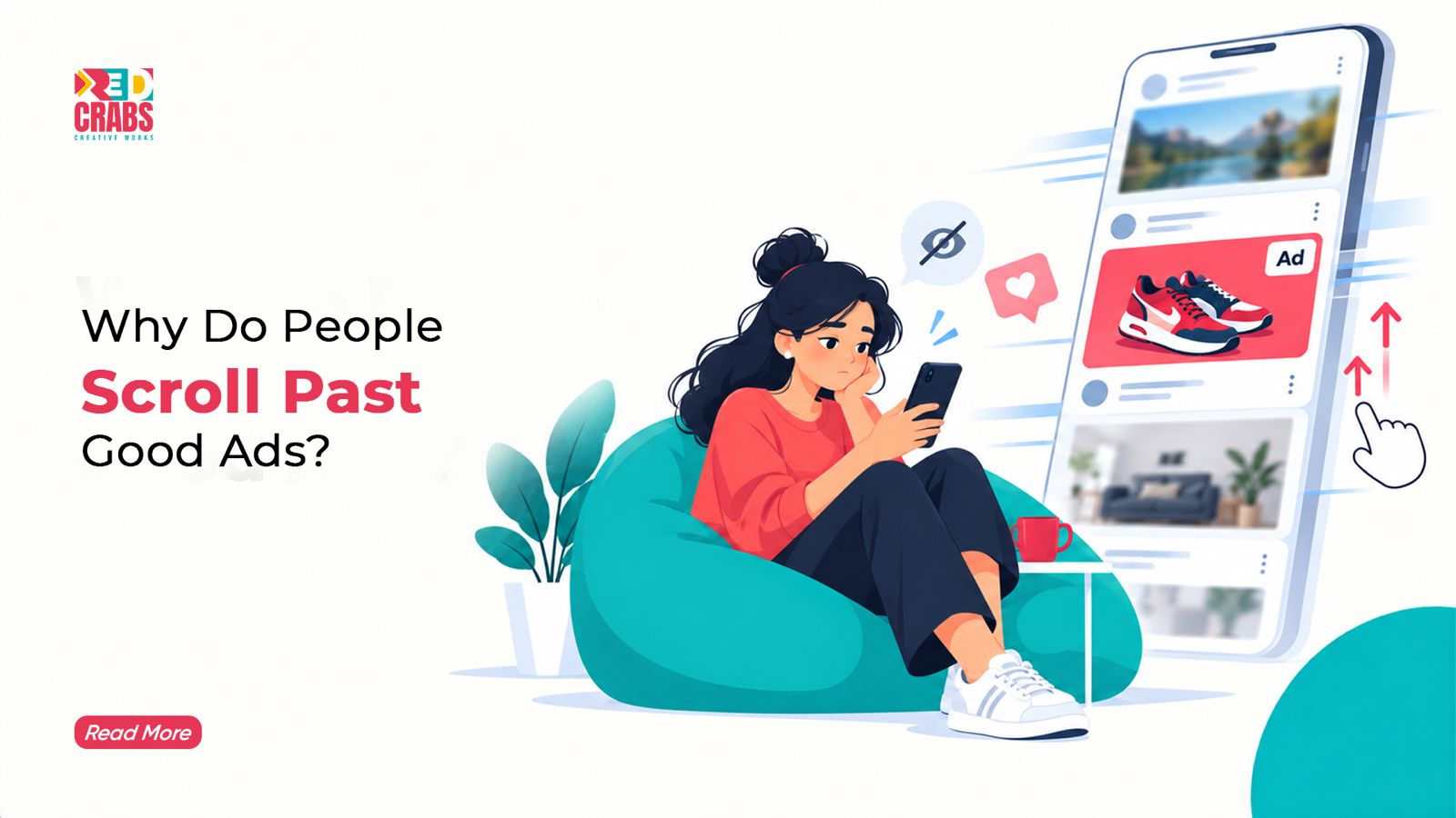


You have probably experienced this yourself. You are scrolling through Instagram or Facebook, and an advertisement appears. The design looks polished, the product seems interesting, and the offer is quite good. Yet, within seconds, you have already moved on to the next post.
Now imagine that same thing happening to your business. You have invested in the creative, planned the campaign, selected your audience, and allocated an advertising budget. Your ad is reaching people, but very few are stopping to look at it.
So, what is going wrong?
The truth is that a good-looking advertisement is not always a good advertisement. People do not stop scrolling simply because a creative has attractive colours, professional photography, or a catchy headline. They stop when something feels relevant, interesting, useful, or worth their attention.
In a digital environment filled with content, brands are competing for a few seconds of someone’s attention. Understanding why people scroll past ads is the first step towards creating campaigns that actually connect with their audience.
Why People Ignore Ads Even When They Look Good
One of the biggest misconceptions in advertising is that good design automatically leads to good performance. While visual quality matters, people make quick decisions about what deserves their attention.
A Gartner survey conducted in October 2025 found that 81% of US consumers surveyed said they try to ignore or tune out advertisements. This highlights the challenge brands face when trying to earn attention rather than simply placing ads in front of people. (Source: Gartner, Marketing Survey Finds 81% of Consumers Tune Out Ads)
There are several reasons behind this behaviour.
1. The ad does not immediately feel relevant
People are usually scrolling for entertainment, information, inspiration, or updates. An advertisement that interrupts this experience without offering something interesting can easily be ignored.
For example, someone browsing fitness content may stop for an advertisement showing a realistic workout routine or a useful fitness tip. A generic product promotion with no clear connection to their interests may not get the same response.
2. The creative looks like every other advertisement
Stock photographs, predictable headlines, generic offers, and familiar layouts can make ads blend into the feed. Even if the product is good, the creative may not give people a reason to pause.
3. The message takes too long to understand
If viewers need to read several lines or watch an entire video before understanding what is being advertised, many may move on before reaching the main point.
4. People have seen the same message too many times
Repeated exposure can make even a well-designed ad feel familiar and uninteresting. When audiences repeatedly encounter the same creative, they may gradually stop paying attention.
5. The advertisement focuses on selling rather than connecting
A message that constantly says “Buy Now”, “Limited Offer”, or “Contact Us” without explaining why someone should care can feel like another sales pitch.
Good advertising needs to give people a reason to pay attention before asking them to take action.
The First Few Seconds Can Decide Everything
When someone encounters an advertisement while scrolling, the opening moments matter. A slow introduction, an unclear visual, or a headline that takes too long to communicate the message can cost the brand its opportunity.
This is particularly important for video advertisements. People may not wait for the product reveal, the brand introduction, or the final offer. The creative needs to communicate something interesting from the beginning.
Google’s ABCD framework for effective video ads highlights four principles: Attention, Branding, Connection, and Direction. It recommends capturing attention early, introducing the brand clearly, building an emotional connection, and giving viewers a specific next step. (Source: Google Ads, ABCDs of Effective Video Ads)
For example, instead of starting a skincare advertisement with a long brand introduction, the video could begin with a relatable skincare concern. Instead of simply displaying a restaurant’s menu, the creative could open with an appetising close-up of its signature dish.
The idea is to give viewers something worth watching immediately.
However, grabbing attention should not mean using misleading hooks or exaggerated claims. The opening needs to create interest while remaining connected to what the advertisement actually offers.
Good Design Is Not the Same as Effective Ad Creative
A professionally designed advertisement can still underperform if its message is unclear.
Think about a typical promotional creative. It may have a beautiful background, multiple product photographs, several lines of text, a discount percentage, contact details, and a prominent call-to-action button.
Individually, these elements may look fine. Together, they may compete for attention.
When everything is highlighted, nothing really stands out.
An effective ad creative strategy starts by identifying the one message the audience should remember. Every visual element, headline, supporting line, and call to action should help communicate that message.
For example, if a brand is promoting a family healthcare membership, the creative should first communicate the benefit that matters most to the intended audience. It could focus on accessible healthcare, family coverage, or preventive care. Trying to explain every feature in one advertisement can make the message difficult to process.
A few principles can make the creative stronger:
- Use one clear headline that communicates the main benefit.
- Make the product or service easy to recognise.
- Keep supporting text short and relevant.
- Use visuals that help explain the message rather than simply decorate it.
- Make the call to action clear and easy to understand.
- Maintain enough visual space so the important information stands out.
The goal is not to make an advertisement look complicated or expensive. It is to make the message easy to understand.
Are Your Ads Talking About the Brand Instead of the Customer?
This is one of the most common problems in social media advertising.
Many advertisements spend most of their space talking about the business. They mention how long the company has been operating, how many products it offers, how advanced its technology is, or how great its services are.
But customers are usually thinking about something else.
They want to know what the product does for them, what problem it solves, whether it is worth their money, and why they should choose it over another option.
Consider these two approaches:
Brand-focused message: “We provide high-quality digital marketing solutions for businesses.”
Customer-focused message: “Getting website visitors but not enough enquiries? Let’s fix the gap between traffic and conversions.”
The second message begins with a situation that a potential customer may recognise. It gives them a reason to pay attention because it addresses a problem they might already have.
The same approach can work across industries. A financial services ad can focus on helping people understand their coverage options. A healthcare ad can address a common concern. A real estate ad can highlight a lifestyle benefit rather than simply listing property specifications.
The more clearly an advertisement reflects the audience’s needs, the easier it becomes for people to understand why it matters.
Repetitive Ads Can Lead to Ad Fatigue
Have you ever seen the same advertisement so many times that you eventually stopped noticing it?
That is one way ad fatigue develops. When audiences repeatedly encounter the same creative, message, or format, the advertisement can gradually lose its impact.
This can happen even when the original creative performs well. A campaign that initially attracts attention may become less effective when the same audience sees it repeatedly without anything new being introduced.
Research from Gartner also highlights how repetitive and intrusive advertising experiences can contribute to negative consumer reactions. Its survey found that some consumers actively take steps to block ads or avoid advertising experiences they find disruptive. (Source: Gartner, Marketing Survey Finds 81% of Consumers Tune Out Ads)
Instead of running one creative continuously, brands should consider testing different versions of their advertisements.
This does not mean changing everything every few days. Small variations can make a difference:
- Try different opening headlines.
- Test alternative images or video formats.
- Introduce different customer benefits.
- Experiment with testimonials and product demonstrations.
- Adapt the message for different audience segments.
A campaign should evolve based on what the audience responds to. The objective is to keep communication relevant without overwhelming people with constant promotional messages.
Why Your Ad Creative Strategy Needs More Than Attractive Visuals
An effective ad creative strategy combines audience understanding, messaging, design, format, and campaign objectives.
Before creating an advertisement, brands should be able to answer a few basic questions:
Who are we speaking to?
A creative designed for college students may need a different tone and visual approach from one targeting working professionals or business owners.
What do we want people to understand?
Every advertisement should have a primary message. Is the brand introducing a product, highlighting a service, promoting an offer, or encouraging people to enquire?
What makes this message worth noticing?
It could be a relatable problem, a useful insight, a product demonstration, a customer experience, or a benefit that genuinely matters to the audience.
What should viewers do next?
A clear call to action helps people understand the next step. Depending on the campaign, this could be visiting a website, sending a message, registering for an event, or exploring a product.
Google’s ABCD framework also recommends combining a clear brand presence with an emotional connection and a specific direction for the viewer. In other words, the advertisement should not only attract attention but also help people understand and remember the brand. (Source: Google Ads, ABCDs of Effective Video Ads)
The strongest creative decisions come from understanding the campaign objective first, rather than beginning with a design trend and trying to fit the message around it.
The Role of the Right Format in Social Media Advertising
Not every advertisement needs to be a static graphic. Different formats offer different ways to communicate with audiences, and the right choice depends on the product, message, and platform.
Static creatives can work well for simple offers, announcements, product highlights, and messages that can be understood quickly.
Short-form videos can demonstrate products, show real experiences, communicate a relatable situation, or introduce a service through storytelling.
Carousel advertisements can help brands communicate multiple benefits, explain a process, or guide audiences through a series of related messages.
Testimonials and creator-led content can introduce a more personal perspective by showing how people interact with a product or service.
For video advertisements, Google recommends using engaging pacing, clear branding, focused messaging, and a strong call to action. (Source: Google Ads, ABCDs of Effective Video Ads)
The format should support the message, not become a creative decision made simply because a particular format is popular.
A product demonstration may communicate more effectively through video, while a limited-time offer might need a simple static creative with a clear headline. Understanding that difference helps brands use their advertising budgets more thoughtfully.
How to Know Whether Your Advertisement Is Actually Working
A common mistake in advertising is judging performance only by impressions, reach, or likes.
These numbers can tell you how many people encountered or interacted with an advertisement, but they do not always explain whether the campaign is contributing to business objectives.
A better approach is to evaluate performance based on the purpose of the campaign.
For awareness campaigns, look at reach, impressions, frequency, and video engagement.
For traffic campaigns, consider link clicks, click-through rate, landing page views, and the quality of website visits.
For lead generation campaigns, pay attention to the number of enquiries, cost per lead, lead quality, and conversion rate.
For sales campaigns, look at purchases, cost per acquisition, and return on advertising spend.
It is also important to understand what happens after someone clicks. If an advertisement generates interest but sends people to a slow, confusing, or irrelevant landing page, the campaign may lose potential customers.
This is why advertising performance should be reviewed as a complete customer journey rather than judging the creative in isolation.
How an Online Marketing Agency Can Help Improve Ad Performance
Creating advertisements that people actually notice requires more than designing attractive creatives and setting up a campaign.
It involves understanding the audience, identifying the right message, selecting suitable formats, testing creative variations, monitoring results, and making improvements based on performance.
An experienced online marketing agency can help businesses bring these elements together. Instead of running advertisements simply to increase visibility, the focus should be on connecting creative decisions with measurable marketing objectives.
At RedCrabs Creative Works, social media advertising should be approached as a combination of strategy and creativity. From campaign planning and audience research to ad creatives, copywriting, testing, and performance analysis, every element should contribute to a clear purpose.
Businesses looking for the Best Digital Marketing Services should look beyond how many advertisements an agency can create or how much reach a campaign can generate. The real value lies in understanding why people should notice the advertisement, what should make them interested, and what action they should take next.
A good campaign does not simply put a brand in front of people. It gives them a reason to care.
The Bottom Line: Stop Trying to Interrupt. Start Giving People a Reason to Look.
People scroll past good ads because good design alone is not enough to earn their attention.
An advertisement needs to be relevant, easy to understand, visually engaging, and connected to something the audience cares about. It should communicate its main message quickly, give people a reason to remember the brand, and make the next step clear.
For businesses, this means moving beyond the idea that more advertisements automatically lead to better results. A thoughtful creative strategy, supported by audience insights and continuous testing, can make advertising more meaningful.
The next time your brand plans a campaign, do not just ask whether the creative looks good. Ask whether someone scrolling through their feed would actually want to stop and look.
Because the best advertisement is not necessarily the one that gets seen by the most people. It is the one that makes the right people pay attention.
Want your advertisements to do more than just appear on someone’s feed? Connect with RedCrabs Creative Works for strategic campaigns, thoughtful creatives, and digital marketing solutions built around your business goals. Get in touch with RedCrabs.