Our Blog

Read our awesome blog article

Featured

Could Nostalgia Be the Secret Ingredient in Your Next Campaign?

Share to

Nostalgia has a rare ability to make people pause. A childhood jingle, an old-school graphic style or a flavour we grew up with instantly pulls us into a familiar emotional space. In a digital world filled with noise, nostalgia offers something refreshing: comfort, memory and connection. When used with intention, it becomes more than a creative idea. It becomes an emotional doorway.

The Psychology Behind Emotional Marketing Campaigns

People remember feelings long before they remember facts. This is why emotional marketing consistently outperforms logic-based communication. Research shows that emotional messaging can deliver significantly higher impact compared to rational messaging alone (Nielsen).

Nostalgia deepens this connection by activating memory-driven emotions. Warmth, safety and belonging are powerful psychological cues. When audiences encounter something nostalgic, they feel it before they analyse it. This instantly builds trust and makes brands feel more relatable and human.

The strategic advantage lies in combining nostalgia with modern storytelling so that it feels both familiar and current.

Brand Storytelling Techniques That Activate Nostalgia

Using Shared Cultural Memory

School assemblies, childhood snacks, early mobile phones, festival traditions and first internet moments carry emotional weight. These shared memories create instant relatability across audiences.

Refreshing Older Brand Assets

Reintroducing classic logos, packaging styles or jingles, but updating them for today’s design sensibilities, helps brands feel familiar without looking dated.

Connecting Past and Present

Strong nostalgic narratives show how people and brands evolve. This gives the campaign emotional depth rather than a simple look-back moment.

Humanising Through Real Moments

Elements like handwritten notes, old photographs, ticket stubs or childhood objects add authenticity. They remind people of emotional moments that shaped them.

These storytelling methods allow nostalgia to become a narrative layer, not a decorative element.

Why Nostalgia Resonates With Today’s Consumers

Modern consumers scroll quickly and disengage easily. Nostalgia works because it slows attention down. It brings the viewer into a moment before presenting the message.

Consumer studies reveal that audiences feel more emotionally connected to brands that incorporate nostalgic themes (HubSpot). Global search trends also show rising interest in retro and memory-driven content as people look for emotional grounding in a fast-paced digital environment (Gartner).

Interestingly, nostalgia appeals across generations. Older audiences respond to lived memories while younger audiences respond to the emotional simplicity nostalgia represents. This makes nostalgia one of the few creative approaches that speaks to everyone differently, yet intimately.

How to Build a Nostalgia Marketing Strategy That Works

Start With the Emotion

Determine what you want the audience to feel. Joy, innocence, warmth, excitement or comfort. This emotional anchor shapes the entire campaign.

Know Your Audience’s Memory Timeline

A millennial’s nostalgia looks different from Gen Z or Gen X. Understanding these differences ensures authenticity.

Blend Retro Cues With Contemporary Design

Nostalgic visuals combined with clean layouts modern typography and premium finishes create a timeless look.

Keep It Authentic

Audiences instantly recognise when nostalgia feels forced. Genuine memory-driven storytelling builds deeper trust and connection.

A successful nostalgia strategy respects the past while presenting it through a lens that feels relevant today.

Example of a Nostalgia Driven Campaign

Imagine a beverage brand that once defined school-day breaks. Instead of recreating an old commercial, the campaign is built around the idea of The Taste of After School.

The visuals capture soft classroom light, scribbled notebooks, the chatter of students, crowded canteens and the excitement of friends running out as the bell rings. The beverage becomes a symbol of freedom, energy and simple joy.

This approach does not bring back the old ad. It brings back the emotion behind it, which is what truly connects with people.

Closing Thoughts

Nostalgia is not just a creative style. It is a strategic emotional tool that strengthens connection, enhances recall and creates lasting brand affinity. Emotional campaigns consistently outperform rational ones because they speak to the heart before the mind, and nostalgia amplifies this by triggering emotions people naturally treasure (Nielsen).

In a fast-moving world filled with fleeting content, nostalgia gives people a meaningful pause. When paired with thoughtful storytelling and modern design, it transforms past

emotions into lasting impact. It makes campaigns feel warm, personal and deeply memorable.

If you are looking to create campaigns rooted in meaningful storytelling we would love to work with you. You can connect with us through our website at redcrabs.in.
 

Leave a Reply

Your email address will not be published. Required fields are marked *

Get updated our newsletter!

    Email


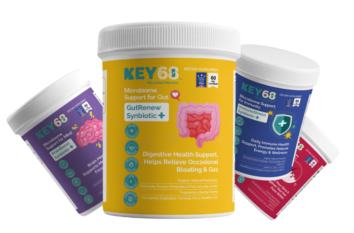
      Packaging design

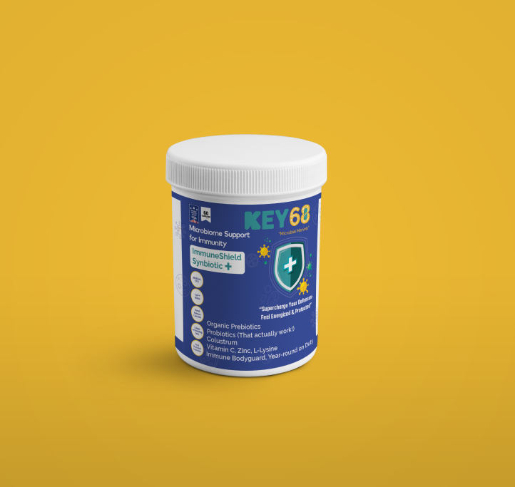
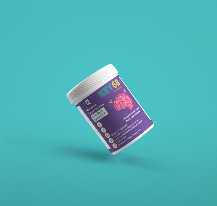
      Key 68

      Project

      • Graphic Design
      • Label Packaging
      • Illustration

      Industry

      Health & Wellness

      Platform

      Supplement & Product

      Url

      https://Key68shopifynet/

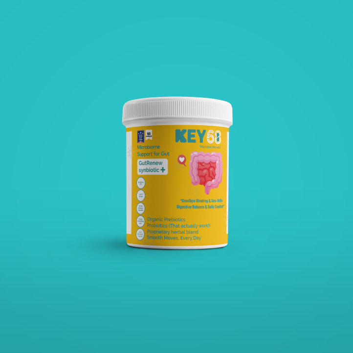
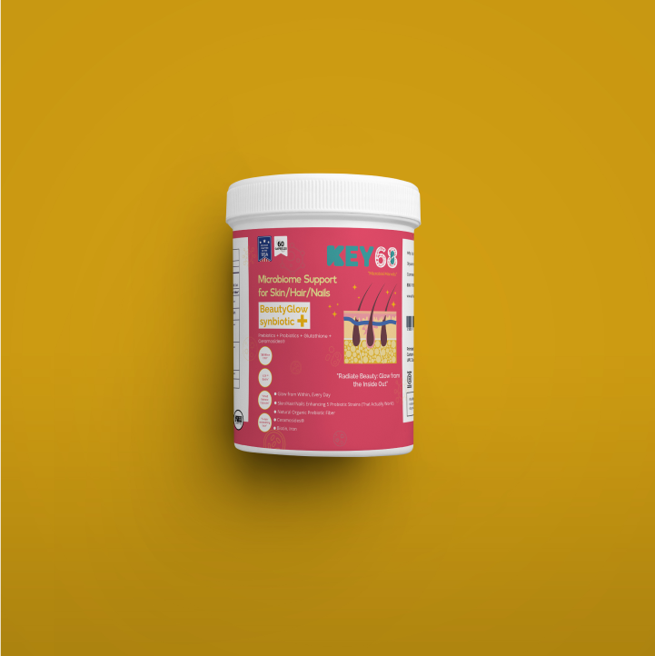
      redcrabs the best digital marketing agency in hyderabad provided Brand Identity & Packaging Design for KEY68

      About project

      Discover the Hidden World Within: Your Microbiome Matters

      Trillions of microscopic allies live within you, supporting your wellness from gut health to overall vitality. This complex ecosystem influences 100+ aspects of your well-being.

      Understanding and nurturing our relationship with the microbial world opens doors to enhanced health and a deeper appreciation for life’s intricate web.

      Find Right Product For Right Solution

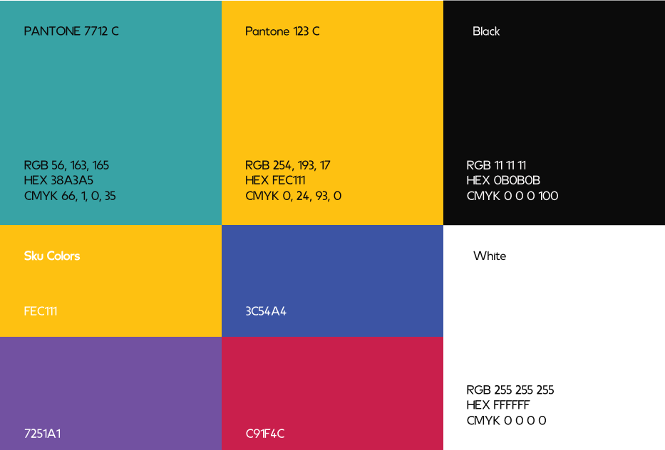
      Color Palette

      The predominant color will be SunflowerYellow.
      It will be used as the main color and
      base color in all its combinations.

      Other colors that will complement
      the brand identity will be 4Skus Respective Colors.

      Typography

      Ambient (Regular)

      Ambient (Regular, Medium, & Bold)

      Aa Bb Cb Dd Ee Ff Gg Hh Ii

      Jj Kk Ll Mm Nn Oo Pp Qq R

      Ss Tt Uu Vv Ww Xx Yy Zz

      0 1 2 3 4 5 6 7 8 9

      Graphic Design

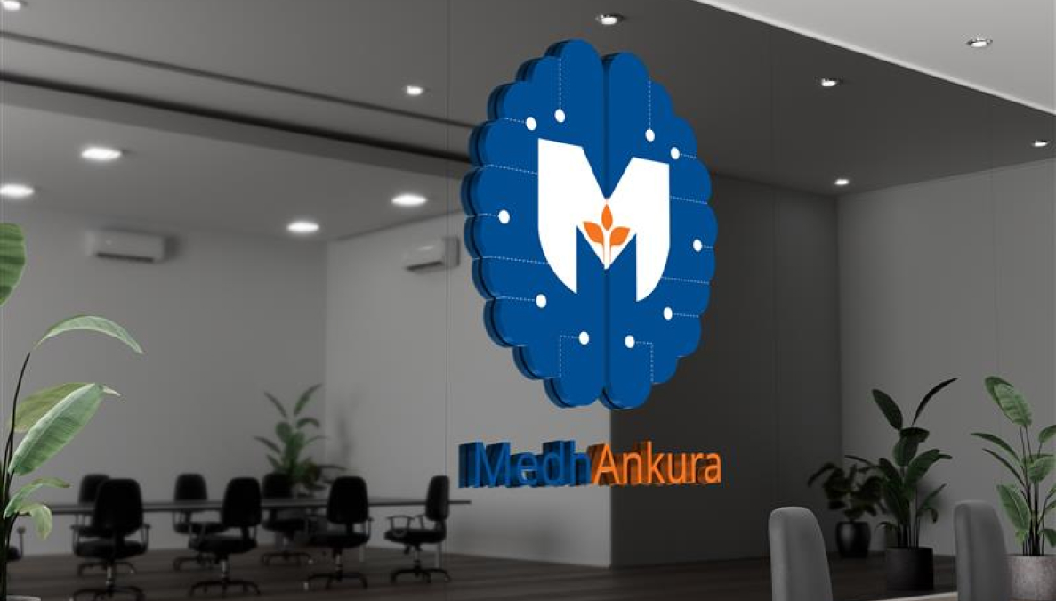
      MedhAnkura

      Project

      • Graphic Design
      • Logo Design
      • Branding

      Industry

      Innovation

      Platform

      Research & Innovation

      Branding

      Research & innovation Company

      Letter ‘M’

      Medha (intelligence or brain)

      Ankura (sapling)

      004C91

      F47421

      THE PULSE OF INNOVATION: MEDHANUKRA’S VISION IN COLOR

      At MedhAnkura, F47421 symbolizes bold energy, passion, and creativity, driving our relentless pursuit of innovative solutions.

      004C91, represents the spark of discovery, illuminating new ideas and guiding MedhAnkura toward transformative solutions.

      Graphic design

      Ayuvu

      Project

      • Graphic Design
      • Logo Design
      • Branding

      Industry

      Medical

      Platform

      Monitoring & Innovation

      Brand Identity

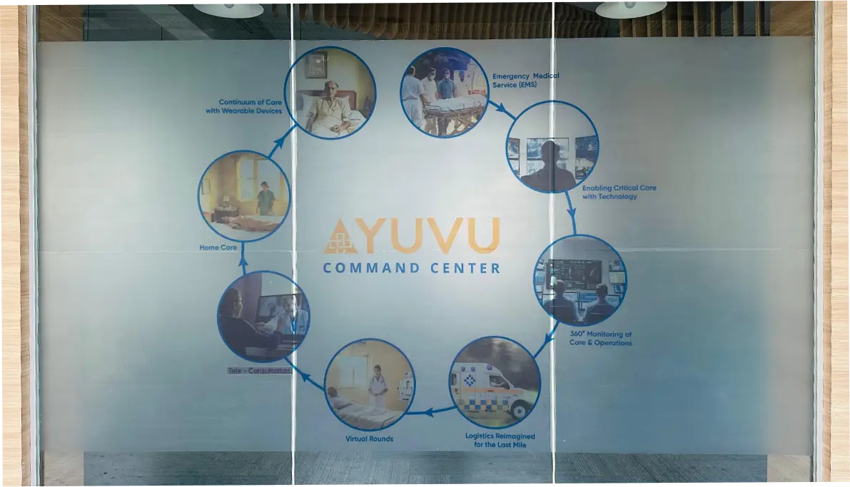
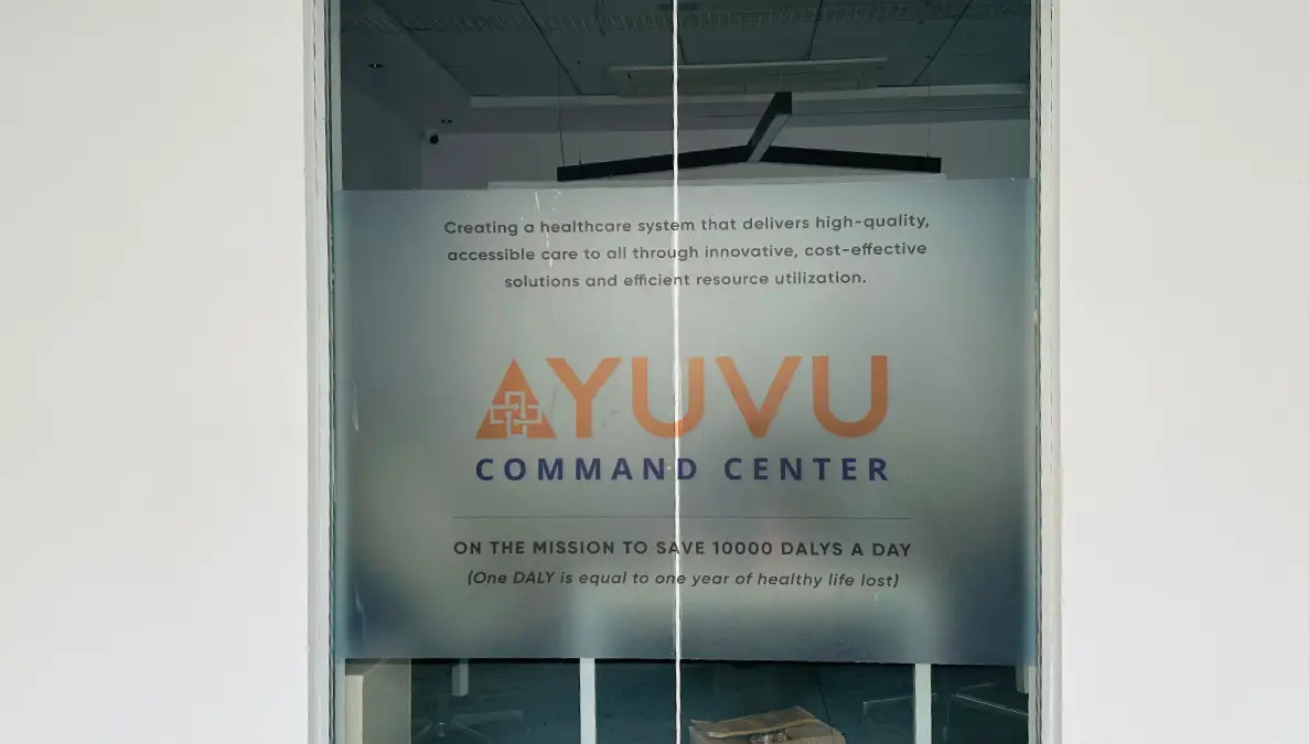
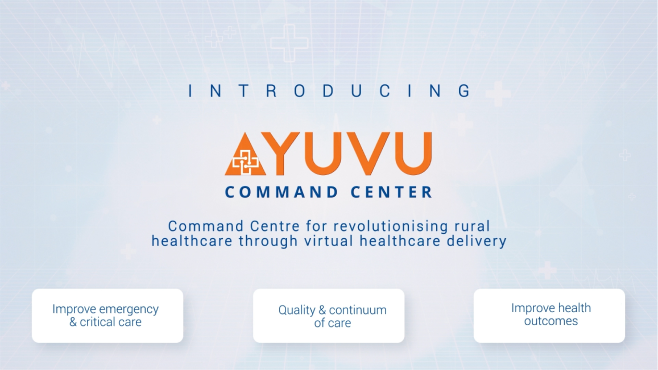
      Ayuvu Command Centre

      Healthcare & Connecting Dots

      Letter ‘A’

      AYUVU Icon

      004C91

      F47421

      AYUVU COMMAND CENTER

      Logo Elements:

      •  Healthcare Symbol: The logo uses a bold, modern cross as its central symbol. This is a widely recognized symbol of health and medical care.
      • Square and Lines: The cross is enclosed within a square. The square can represent stability, structure, and order.

      Health Care Hub

      The logo could represent a central hub for a healthcare network, connecting people to health resources and medical professionals regardless of location.
      Global Reach

      The Dots extending outwards could signify the organization’s global reach, providing healthcare services to people around the world.
      Collaboration

      The cross, a symbol of medicine, intertwined with a square, which can represent technology or structure, could embody the concept of health and technology working together.

      Colour Scheme

      Blue: Blue is associated with trust, security, and professionalism, all of which are important for a healthcare organization.

      Orange: Orange Is associated with trust, security, and professionalism, all of which are important for a healthcare organization.

      Video design

      Ayuvu

      Command Centre

      Project

      • Video Design
      • Video Editing
      • Visual Communication

      Industry

      Healthcare

      Platform

      Visual Communication & Healthcare

      Video Design & Editing

      Ayuvu Command Centre

      Video design

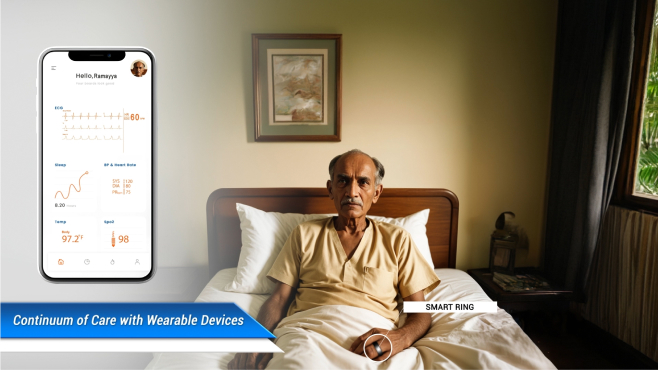
      RAMAYYA
      Story

      Project

      • Video Design
      • Video Editing
      • Visual Communication

      Industry

      Healthcare

      Platform

      Visual Communication & Healthcare

      Video Design & Editing

      Story Narration

      ATL/BTL

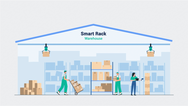
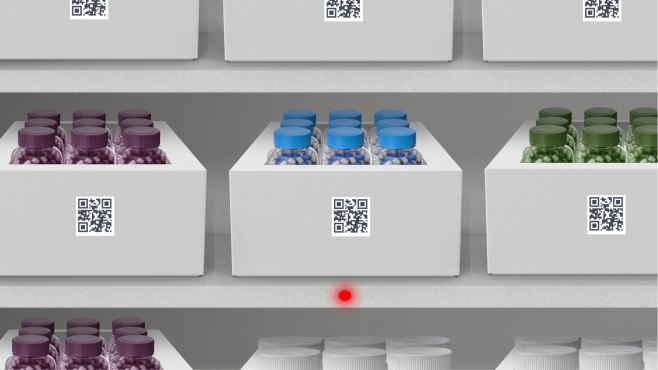
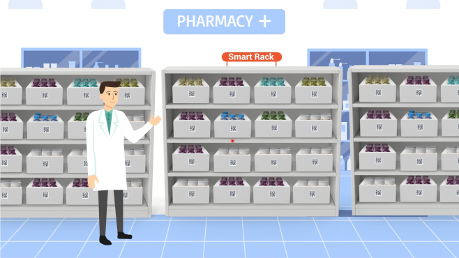
      Smart Rack

      Project

      • Video Design
      • Video Editing
      • Visual Communication

      Industry

      Healthcare

      Platform

      Pharma & Inventory management

      Video Design & Editing

      Smart Rack

      ATL/BTL

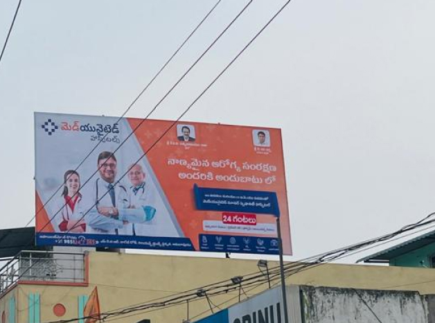
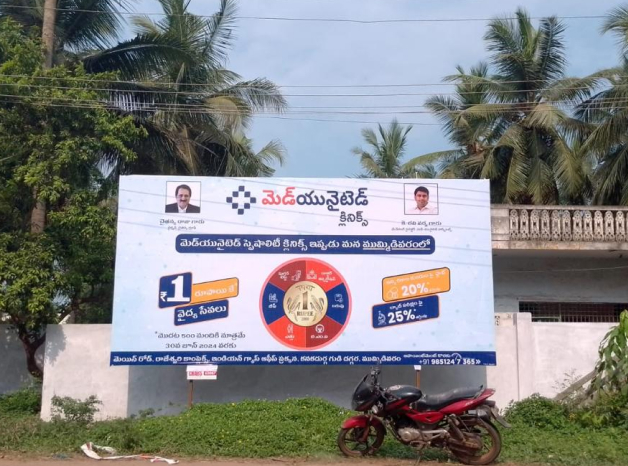
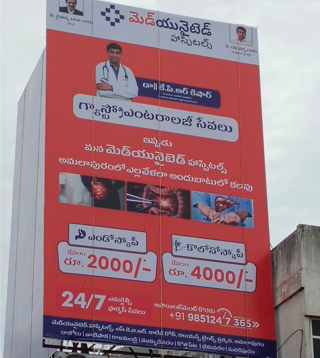
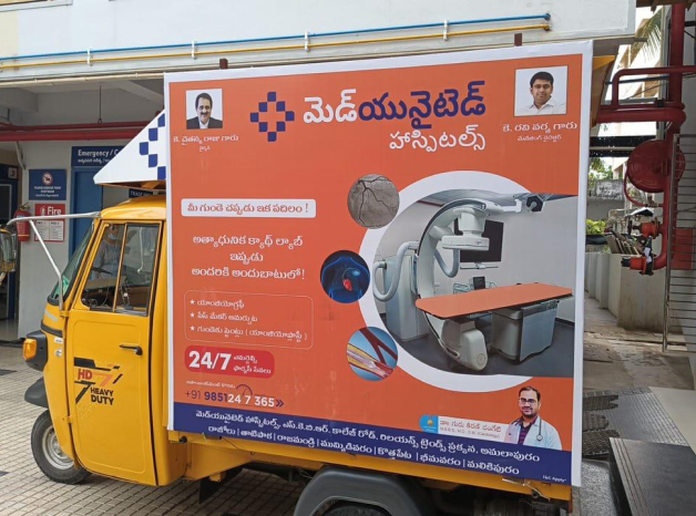
      MedUnited

      Hospitals

      Project

      ATL/ BTL

      Industry

      Healthcare

      Platform

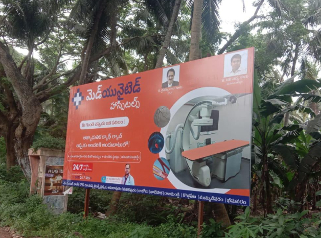
      Hospitals & Clinics

      ATL/BTL

      Hospitals & Clinics

      ATL (Above The Line)

      WhatsApp Image 2024-11-08 at 20.29.33_3d5d49e3

      BTL (Below the Line)

      2024 - World Heart Day “Health Walk”(Amalapuram)

      Research & Validation

      MedUnited
      Hospitals

      Project

      • Market Research
      • Market Validation
      • Secondary Research
      • Competitor Analysis
      • Business Audits
      • Cluster Research

      Industry

      Healthcare

      Platform

      Research & Validation

      Research & Validation

      MedUnited Hospitals

      COMPANY OVERVIEW

      At RedCrabs, our Research & Validation team specializes in delivering thorough market insights, competitive analysis, and data-driven strategies. We provide valuable guidance to support our clients’ expansion, market entry, and sustained growth. Our client portfolio includes prominent healthcare(MedUnited, KIMS, AyuvuBharosa), technology, insurance(Trovity) and real estate firms like Avaasa. Below is a detailed breakdown of our work for MedUnited, covering our processes in competitor analysis, market validation, primary and secondary research and market scope identification.

      01.

      Competitor Analysis

      02.

      Market Validation

      03.

      Primary and Secondary Research

      04.

      Identifying Scope of Expansion

      Competitor Analysis

      Our work with MedUnited included a thorough Competitor Analysis to identify key players in the healthcare market across the Amalapuram and Raipur clusters. By examining the service portfolios, pricing structures, patient satisfaction levels, and unique value propositions of competitors, we highlighted areas where MedUnited could differentiate its services. The analysis informed MedUnited about

      Gaps in competitor offerings

      Strengths and weaknesses of local and regional competitors

      at RedCrabs we help you identify the Strengths and weaknesses of local and regional competitors

      Potential strategies for attracting and retaining patients based on competitor insights

      This competitor analysis equipped MedUnited with a clear view of the competitive landscape, highlighting positioning opportunities that would appeal to a diverse patient demographic.

      MARKET VALIDATION
      To ensure the feasibility of MedUnited’s market expansion, we conducted Market Validation focusing on both secondary and primary data sources to understand demand, healthcare accessibility, and community health needs in Amalapuram and the surrounding areas. Our validation process included:

      “Analysis of the demographic and socio-economic profile of the target market.”

      “Evaluation of healthcare spending patterns and patient preferences.”

      “Assessment of healthcare provider density and demand for specific medical services.”

      Through these insights, we confirmed the region’s demand for expanded healthcare services and identified areas where MedUnited could introduce differentiated offerings, making an impact in underserved communities.

      PRIMARY AND SECONDARY RESEARCH

      Our approach relied on Primary and Secondary Research methods to gather data accurately and comprehensively:

      Primary Research

      We conducted on-the-ground surveys with patients, doctors, and healthcare administrators across hospitals and clinics in Amalapuram, Raipur, and Palakole clusters. By engaging with local residents and healthcare providers, we obtained firsthand insights into patient satisfaction, treatment preferences, common health issues, and unmet needs. The findings allowed MedUnited to align its offerings with patient expectations and to tailor services to meet specific local needs.

      Secondary Research

      Supplementing our primary data, we compiled relevant industry reports, regional healthcare statistics, and previous market studies. This secondary data was crucial in establishing benchmarks and understanding healthcare trends, allowing us to cross-reference and validate findings from primary research.

      Together, these research efforts built a holistic view of the healthcare landscape, identifying immediate opportunities for MedUnited’s growth while ensuring that all recommendations were data-driven and reflective of actual market conditions making us the best digital marketing agency in Hyderabad.

      Identifying Scope of Expansion

      With data from our competitor analysis and market research, we identified the scope for MedUnited’s expansion across Raipur, Palacole and Amalapuram clusters. Key areas we highlighted included:

      Service Expansion: Based on the feasibility survey data, there was a marked need for specialized care facilities, such as Nephrology & Cardiology , which were underrepresented in the local healthcare market.

      Patient-Centric Services: High demand for affordable, accessible healthcare services indicated potential for MedUnited to expand by offering services like telemedicine, home healthcare, and medicine delivery to reach underserved rural populations.

      Partnership Opportunities: We identified opportunities for strategic partnerships with local clinics and healthcare providers, allowing MedUnited to increase its footprint quickly and efficiently.

      Our work for MedUnited showcases how RedCrabs leverages robust research and validation processes to provide clients with the strategic insights needed to make informed decisions and enter new markets with confidence. Our commitment to data-driven strategies helps clients like MedUnited achieve impactful, sustainable growth.

      UX/UI design

      GFI
      (GOLF FEDERATION OF INDIA)

      GFI
      (GOLF FEDERATION OF INDIA)

      Project

      • UI/UX
      • Web Development
      • Illustration

      Industry

      Sports

      Platform

      Website

      GFI (Golf Federation of India)

      About project

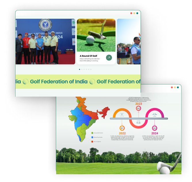
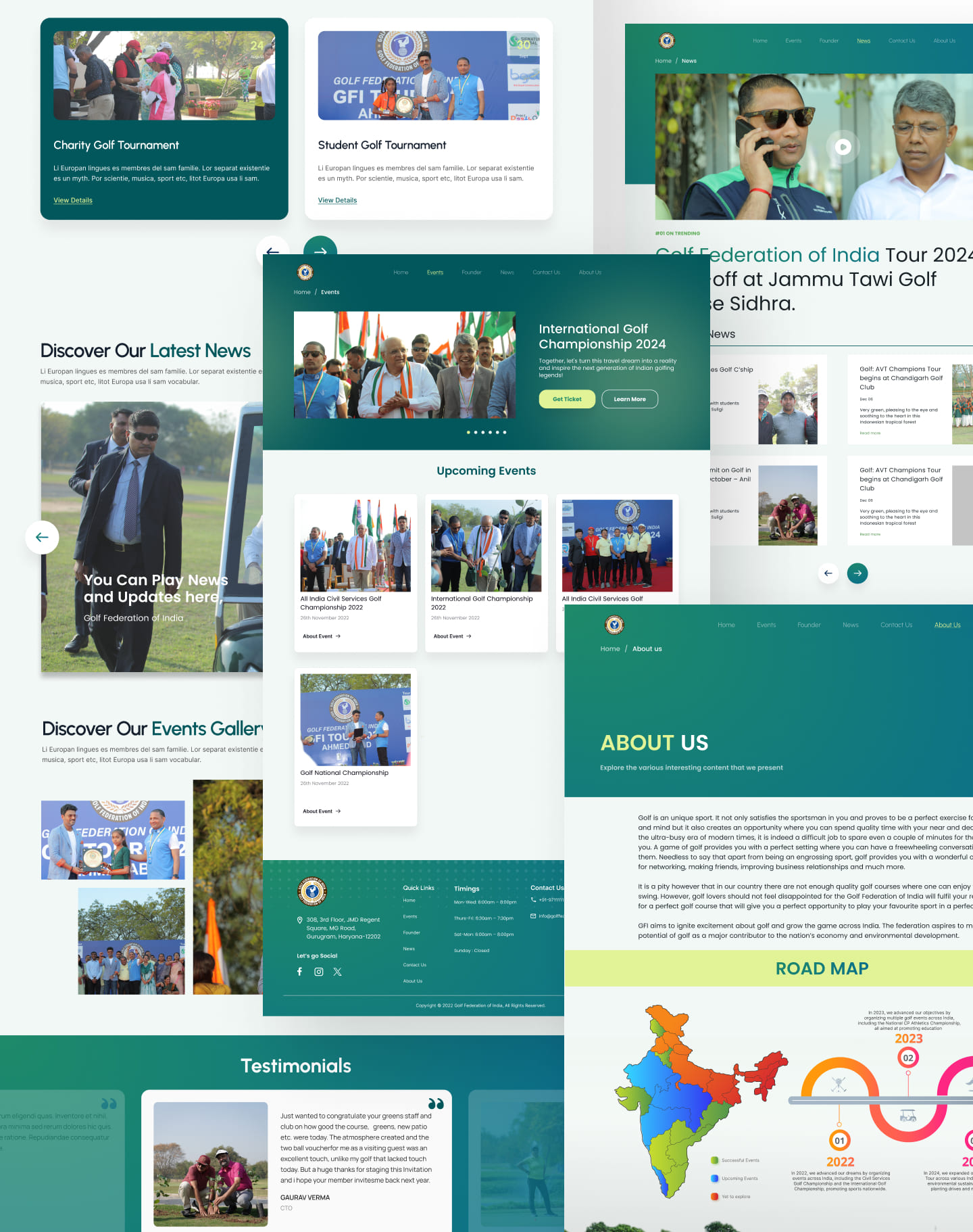
       The redesign of the Golf Federation of India (GFI) website focuses on modernizing its digital presence with a clean, responsive, and user-friendly interface. The new site enhances navigation, making it easier to access tournament schedules, rankings, and membership details. A key feature is the integration of a tournament management system for live scores and registrations, along with a dedicated member portal for personalized services.

      The redesign also supports GFI’s mission to promote golf across India, highlighting initiatives like “Gaon se Golf Tak” and grassroots programs. With a fresh visual appeal, media-rich content, and social media integration, the website will serve as a central hub for players, fans, and the golfing community.

      Design System

      Primary Colors

      Shadows styles

      Ui Designs

      UX/UI design

      ZENLIVES/ ZENTEENS

      Project

      • UI/UX
      • App Development
      • Illustration

      Industry

      Mental Health

      Platform

      Mobile Application

      APPS

      ZENLIVES/ ZEN TEENS

      About project

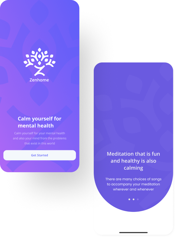
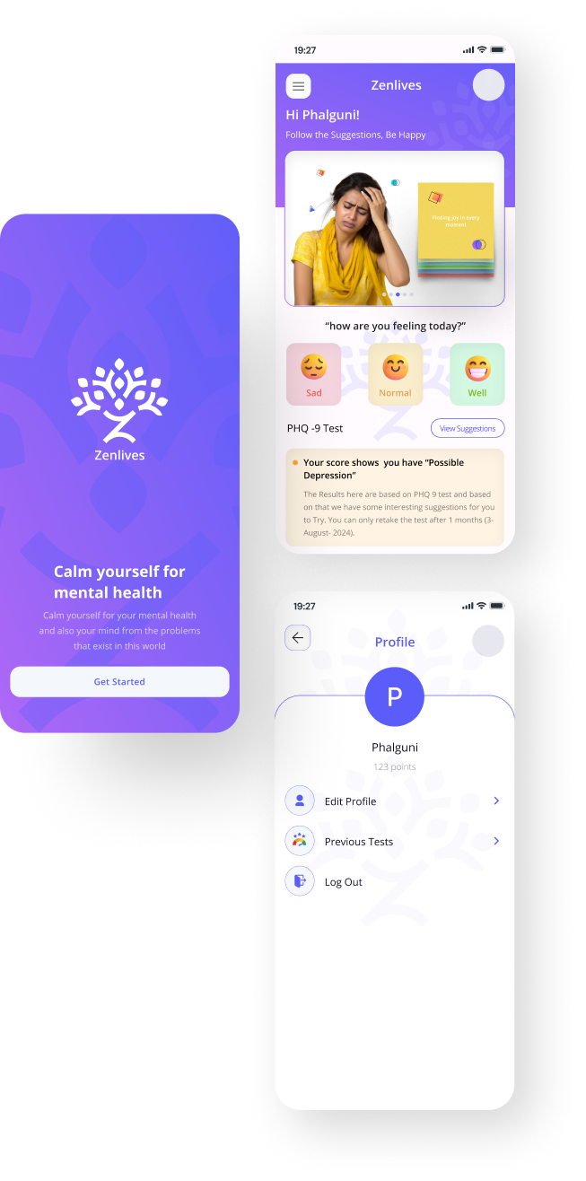
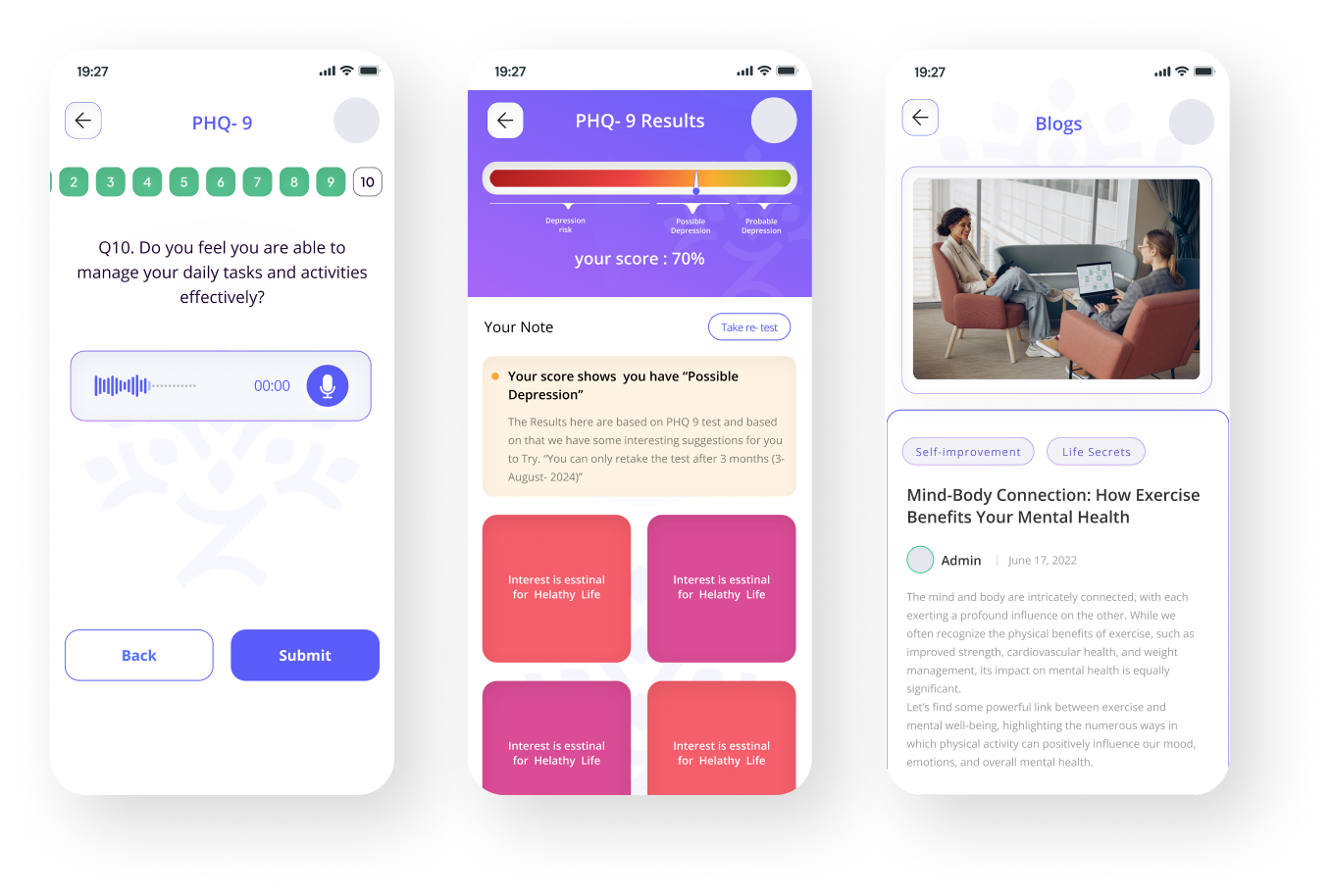
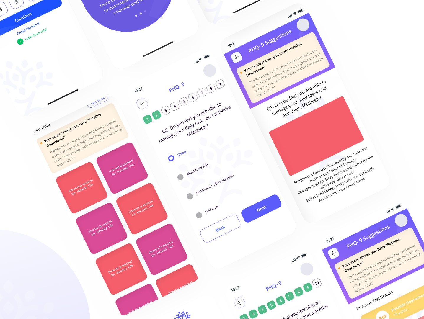
      ZenLives and ZenTeens are mental health apps designed to help adults and teens manage their well-being through personalized guidance. By answering mental health questions, users receive tailored strategies for managing stress, anxiety, and depression. ZenLives offers support for adults facing work or life challenges, while ZenTeens caters to teens dealing with school pressure and emotional growth. Both apps feature a calming, user-friendly interface and incorporate mindfulness practices like meditation and breathing exercises, empowering users to take control of their mental health.

      Design System

      Design System uses soothing colors and simple layouts, with ZenLives mature and ZenTeens vibrant, ensuring easy, accessible use.

      UI screens